| These pages are written in ASCII encoding |
|
| These pages are written in ASCII encoding |
|
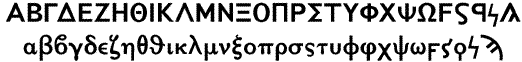
The typefaces we use are the authentic Monotype machine typefaces, adapted to the computer and often enhanced by us. The most popular one is the so called aplá ("plain") or "Greek 90/91/92," following a design of the great French typographer Didot:
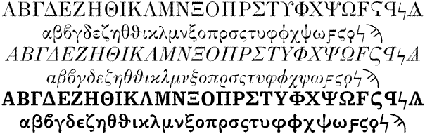
Note that the inclined letters of this typeface are not just a slanted version of the straight ones, but are specially (and most beautifully) designed. In Greece, the inclined letters are called Lipsías ("from Leipzig").
Also very well known are the so-called "Elsevier" letters, also known as Times:
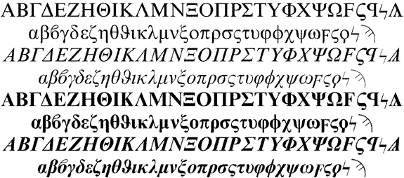
Note that this is not the Times New Roman typeface of Windows 95 but the authentic
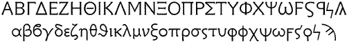
"Elsevier" of Monotype machines. One of our favourite typefaces is the Attiká
("from Attica"), also called "New Hellenic," designed by Scholderer in 1927:
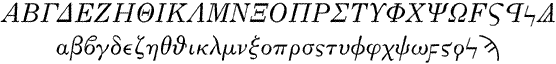
Another typeface which is used very intensively in British editions of Greek texts, but also
often in Greece (for excerpts of ancient Greek text in modern Greek texts) is Porson
designed by Austin in 1810:
Also we offer typesetting in a bolder typeface called Greek Sans 486
which is more suitable for French editions of Greek texts:
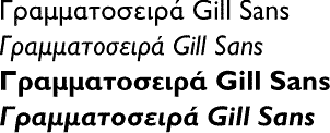
Finally, for more modern texts, we also use the Greek Gill Sans typeface which, besides a very nice inclined version, also fits very well with the corresponding Latin typeface (and the Cyrillic counterpart which we do not show here):
But having a typeface alone is not sufficient for making good Greek typography. After a long study of Greek printing, we have developed systems alowing strict respect of traditional Greek typesetting rules (punctuation, hyphenation, etc.).
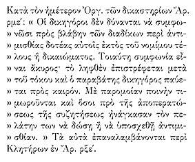
For example, in the following text, note the inverted guillemet at the beginning of every line. This is a typographical convention of the late 19th and early 20th century:
In our work we give great importance to little details. For example, as you can see in the following figure, the Greek apostrophe does not have the same shape as the Latin apostrophe (although both share the name "apostrophe"):
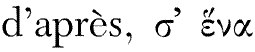
We see that the Greek apostrophe has the shape of the smooth breathing (indeed in some cases of vowel transformations in ancient Greek, the apostrophe is combined with an accent, like a breathing), while the Latin apostrophe has more or less the shape of a comma. In computing this distinction requires special attention (and has to be done automatically by the software and not by the user) since all encodings identify the two apostrophes.
Another sample of typographical detail can be seen in the following verses by Kalvos:
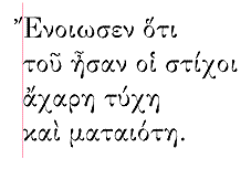
The red vertical line is to show that breathings and accents are typeset "hanging" on the margin and that the line has been justified with respect to the vowel and not the diacritic. This is a rule more often applied in poetry than in prose.