| These pages are written in ASCII encoding |
|
| These pages are written in ASCII encoding |
|
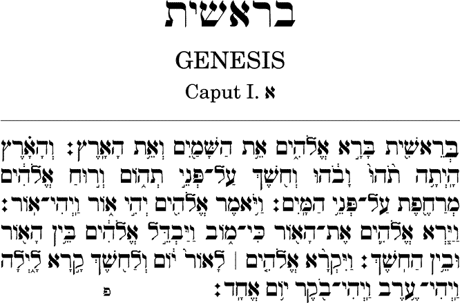
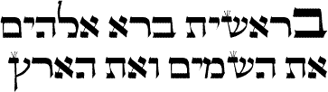
He have studied in great detail the typesetting of the Hebrew Bible. In the sample below you can see the beginning of the Genesis book: (for more detail see the corresponding PDF Acrobat file)
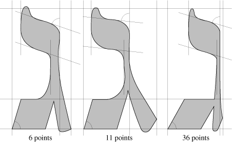
The typeface we designed specially for the Bible are meta-characters in the sense that they change their form according to their size. Small characters have simpler forms and the difference between thin and fat strokes is smaller, so that legibility is higher/ Bigger characters have more difference between thin and fat strokes so that they become more elegant (in a "Bodoni-like" esthetic frame). Here is, for example, the same letter in three different sizes (6, 11 and 36 points):
The big difficulty in typesetting the Bible is the placing of diacritics. Besides vowels (and semi-vowels) which are placed above or under the letter, there is another kind of diacritical marks, the so-called masoretical marks (or neumes) used in cantillation. Typesetting of vowels and cantillation marks is very complex and our system is the only one respecting the traditional typographical rules.
Every Hebrew letter has two axes on which we place diacritics: the superior and the inferior one:
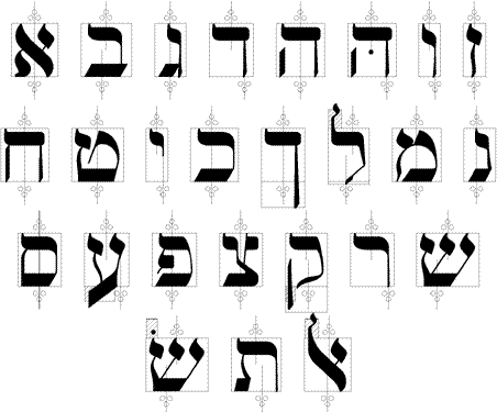
(the last glyph of this list is not a letter but the aleph-lamed ligature). On this figure we also see the so-called "forbidden zones", where no diacritic can be placed.
Let us now suppose we have to place a vowel "primary diacritic" and a cantillation mark "secondary diacritic" under a letter L followed by a letter L':
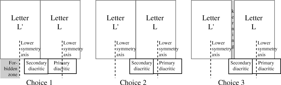
On the figure we see the lower axes of letters L and L'. The first case we consider is
the following: the vowel is centered with respect to the axis, and the cantillation mark
is adjacent. If there is room enough (that is, if the cantillation mark does not touch the
axis of letter L'), then we have acheeved our goal.
If there isn't room enough, then we proceed to the second case: we consider the vowel and the
cantillation mark as one block and center this block with respect to the axis. If again there isn't
room enough, then we add interletter space between letters L and L', until there is room enough.
It is remarkable that between case one and two there is no intermediate solution: either the vowel is centered, or the combined vowel and cantillation mark (with eventual kerning between them).
The Bible is the holy book of Judaism and no alteration of it is allowed. At times some errors have been introduced while copying: these errors remain today in all printed editions. Because of this we have letters broken, raised, inverted, bigger or smaller than normal, with wrong contextuality, etc. These cases are very rare (most of them are unique) and are all covered by our system. We give a detailed list of these typographical oddities in this paper (pages 8-11).
Besides our own font (Tiqwah) we also provide typesetting in the most important and most beautiful classical Hebrew typefaces: Hadassah, Frank-Rühl, Drugulin and Myriam. In the following picture you can see our font Tiqwah (first from top) at 9 points compared to (from top to bottom) Hadassah, Frank-Rühl and bold Drugulin.
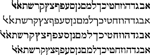
The glyphs you see at the end of the alphabet are the two variants of the traditional aleph-lamed ligature.
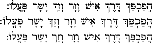
We have adapted these fonts to our typesetting system, in particular we have defined for each letter of each font the exact position of the upper and lower vowel placement axis and forbidden zones. By this, we are able to use only a single glyph for every vowel and diacritic and still obtain perfect placement for each letter and each font. Here is an example: the same Biblical verset in Tiqwah, Frank-Rühl and Hadassah. Notice the vowels under letters daleth, heth, waw, resh, zayn, ayn, yod and shin: for none of these letters the vowel is actually centered.
We also offer typesetting of Yiddish (with the corresponding hyphenation rules), Ladino and Judeo-Arabic, in all fonts mentioned above.
An older type of letters is used for typesetting certain books containing Torah texts (books for training to read from the scroll, without vowels or cantillation marks; for example, for people preparing their bar-mitzvah):
We also offer typesetting using Rashi letters:
![]()